

village fitness
Rebranding for a Fitness area in Italy
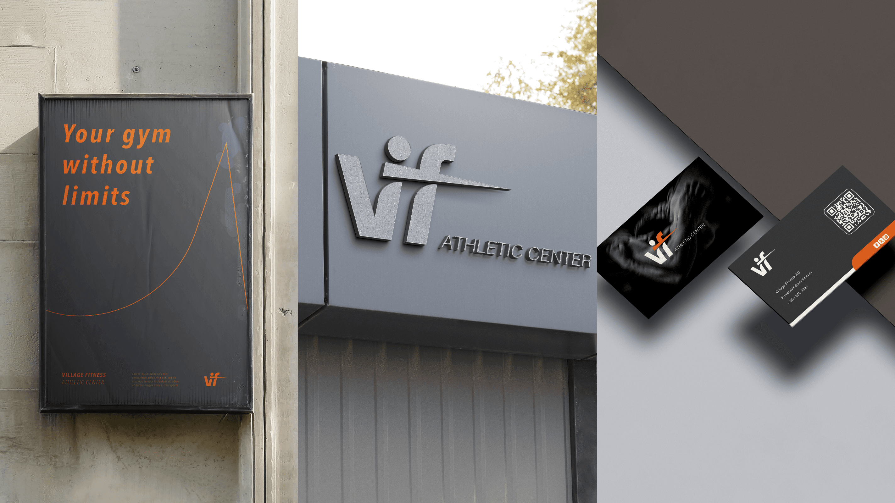
For Village Fitness, a community focused fitness center, the objective was to redesign the brand identity to better reflect energy, inclusivity, and a modern approach to wellness.
The client needed a visual system capable of communicating strength, movement, and motivation, while remaining approachable and suitable for a wide audience, from beginners to experienced athletes.

Design process
The resulting visual identity is built around the concept of movement and community.
Strong geometric shapes and clean lines symbolize stability and performance, while the overall composition remains open and dynamic, reflecting the inclusive and welcoming nature of the brand. Each design choice was guided by clarity, legibility, and visual impact, creating a brand that feels confident, contemporary, and easy to recognize.
The system was developed to be flexible and scalable, ensuring consistency across digital platforms, printed materials, and in-gym applications.

Old logo
Subtitle
Title
Title
New Logo
New Logo

Web Design
Starting from the new brand identity, I designed a user-friendly website prototype focused on clarity, accessibility, and engagement.
SITE STRUCTURE
The website is structured into clear and functional sections:
A dynamic Homepage that immediately communicates the brand’s energy and values, highlighting key services and membership options
An About / Philosophy section that explains the mission of Village Fitness and its approach to training and well-being
Dedicated sections for Classes, Training Programs, and Facilities, supported by visual content
A Contact area with clear calls-to-action for memberships and inquiries
INTUITIVE DESIGN
The layout is clean, modern, and performance-oriented.
Strategic use of white space, bold typography, and strong visual hierarchy guides the user through the content without friction.
Clear CTAs such as “Join the community”, “View classes”, and “Get started” are positioned to encourage interaction and conversion, ensuring a smooth and engaging navigation experience across desktop, tablet, and mobile devices.
View Website
other Projects


Hi
Let's work together
write me an email or connect on one of my social networks

village fitness
Rebranding for a Fitness area in Italy
For Village Fitness, a community focused fitness center, the objective was to redesign the brand identity to better reflect energy, inclusivity, and a modern approach to wellness.
The client needed a visual system capable of communicating strength, movement, and motivation, while remaining approachable and suitable for a wide audience, from beginners to experienced athletes.
Design process
The resulting visual identity is built around the concept of movement and community.
Strong geometric shapes and clean lines symbolize stability and performance, while the overall composition remains open and dynamic, reflecting the inclusive and welcoming nature of the brand. Each design choice was guided by clarity, legibility, and visual impact, creating a brand that feels confident, contemporary, and easy to recognize.
The system was developed to be flexible and scalable, ensuring consistency across digital platforms, printed materials, and in-gym applications.
Old logo
Subtitle
Title
Title
New Logo
New Logo
Web Design
Starting from the new brand identity, I designed a user-friendly website prototype focused on clarity, accessibility, and engagement.
SITE STRUCTURE
The website is structured into clear and functional sections:
A dynamic Homepage that immediately communicates the brand’s energy and values, highlighting key services and membership options
An About / Philosophy section that explains the mission of Village Fitness and its approach to training and well-being
Dedicated sections for Classes, Training Programs, and Facilities, supported by visual content
A Contact area with clear calls-to-action for memberships and inquiries
INTUITIVE DESIGN
The layout is clean, modern, and performance-oriented.
Strategic use of white space, bold typography, and strong visual hierarchy guides the user through the content without friction.
Clear CTAs such as “Join the community”, “View classes”, and “Get started” are positioned to encourage interaction and conversion, ensuring a smooth and engaging navigation experience across desktop, tablet, and mobile devices.
View Website
other Projects
Hi
Let's work together
write me an email or connect on one of my social networks